Visual Hierarchy in NFT Design: Enhancing User Navigation
Understanding Visual Hierarchy in Design
Visual hierarchy refers to the arrangement and presentation of elements in a way that guides the viewer's eye. In the realm of NFT (Non-Fungible Token) design, this concept is crucial because it helps users navigate through digital artworks and collections effortlessly. By using size, color, and placement, designers can create a flow that intuitively leads users to the most important information.
Design is not just what it looks like and feels like. Design is how it works.
Just like a well-organized bookstore, where bestsellers are front and center, effective visual hierarchy makes key elements stand out. This ensures that users can easily find what they are looking for, whether it’s a specific NFT, artist, or category. Understanding this principle can significantly enhance user engagement and satisfaction in the often chaotic world of digital art.
In essence, visual hierarchy transforms a flat, confusing interface into a dynamic experience that feels both inviting and informative. By consciously applying these principles, NFT designers can create layouts that not only look good but also serve a functional purpose, making user navigation a breeze.
Key Principles of Visual Hierarchy
Several key principles underpin effective visual hierarchy, including size, contrast, and alignment. The size of elements can draw attention; larger items typically suggest importance, while smaller ones recede into the background. Similarly, contrast—using differing colors and shades—can highlight critical features or calls to action, making them pop against the rest of the design.
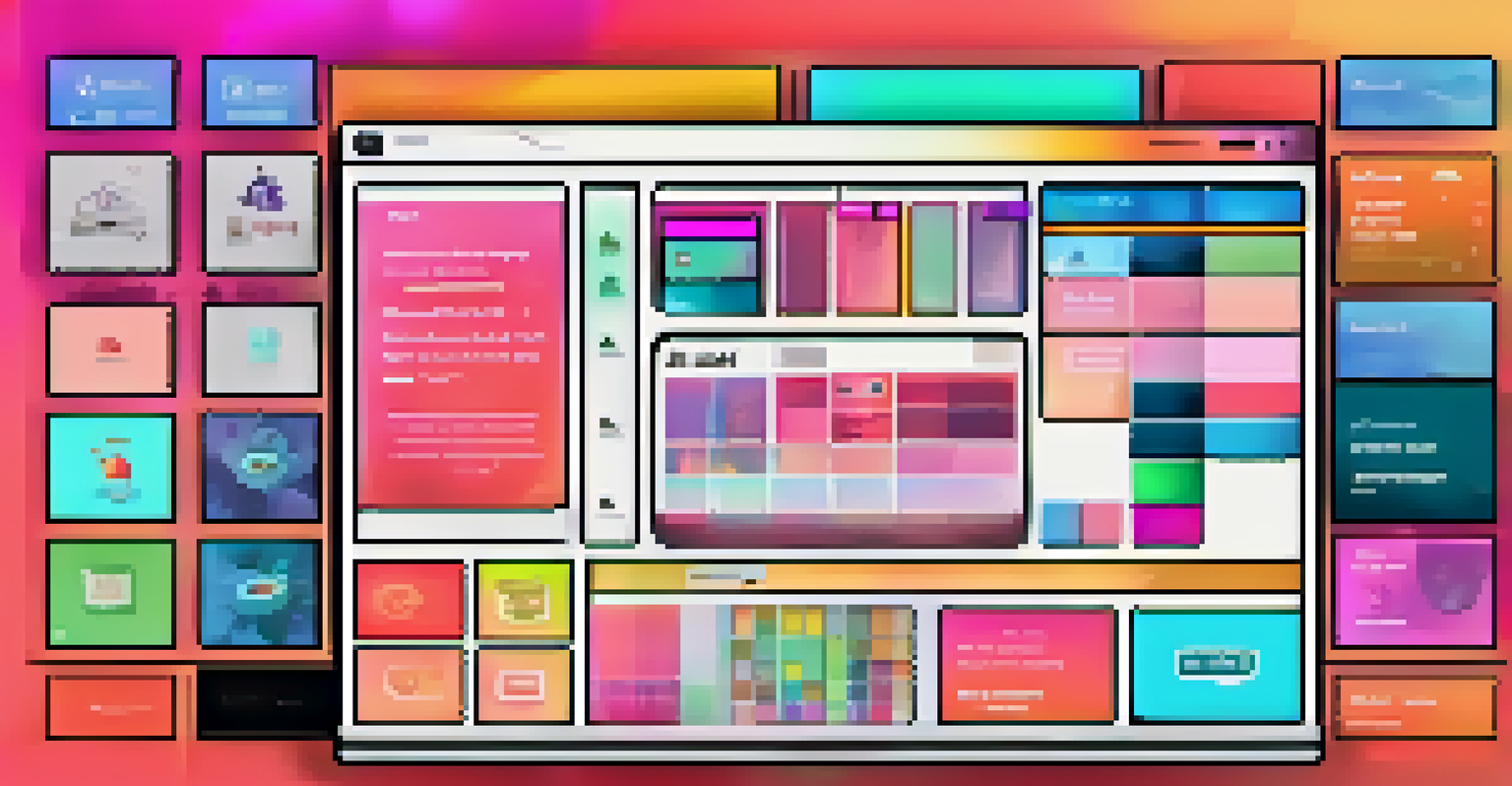
Alignment is another vital aspect; when elements are neatly lined up, it creates a sense of order and cohesion. For instance, a grid layout for displaying NFTs not only looks organized but also helps users quickly scan through items. This structured approach can significantly enhance usability, allowing users to focus on content rather than getting lost in disarray.
Visual Hierarchy Guides Navigation
Visual hierarchy arranges design elements to effectively guide users through digital artworks and collections.
Combining these principles effectively can create an engaging user experience. For example, a prominently displayed 'Buy Now' button in a contrasting color can guide users toward making a purchase decision, while smaller details about the NFT can be placed subtly beneath it, ensuring that the most critical actions are easy to spot.
Using Color to Enhance Navigation
Color plays a pivotal role in visual hierarchy, influencing mood and guiding user interaction. In NFT design, strategic use of color can help delineate different sections or categories, making navigation intuitive. For example, a vibrant color scheme can draw attention to new releases, while muted tones can indicate archived or less important items.
Good design is as little design as possible.
Moreover, color can also evoke emotions and associations, enhancing the user's connection to the artwork. A warm palette might suggest creativity and passion, while cooler tones can evoke calmness and serenity. By aligning color choices with the intended message of the NFTs, designers can create a more cohesive and engaging experience.
It's important, however, to maintain balance and avoid overwhelming users with too many clashing colors. A harmonious color palette, combined with well-planned hierarchy, can lead to a visually stunning and easy-to-navigate platform that keeps users coming back.
The Role of Typography in NFT Design
Typography is often an overlooked aspect of visual hierarchy, yet it plays a crucial role in guiding users through NFT designs. Different font sizes, weights, and styles can communicate importance and structure within the interface. For instance, larger headings can help differentiate categories or sections, while smaller text can convey details about individual NFTs.
Choosing the right typeface can also set the tone of the design. A bold, modern font might resonate with a contemporary art piece, while a classic serif could complement traditional artwork. This alignment between typography and the artwork itself enhances the overall user experience, making it feel more curated and thoughtful.
Color Enhances User Experience
Strategic use of color in NFT design can delineate sections, evoke emotions, and improve navigation.
Furthermore, readability should always be a priority. Clear and legible typography ensures that users can easily absorb information without straining their eyes, making navigation smoother and more enjoyable. This attention to detail in typography can significantly elevate the perceived quality of the NFT platform.
Creating Space: The Importance of White Space
White space, or negative space, is the area between design elements, and it is an essential component of visual hierarchy. It helps prevent the interface from feeling cluttered, allowing for better focus on key elements. In NFT design, effective use of white space can enhance user navigation by providing visual breathing room around artwork and important information.
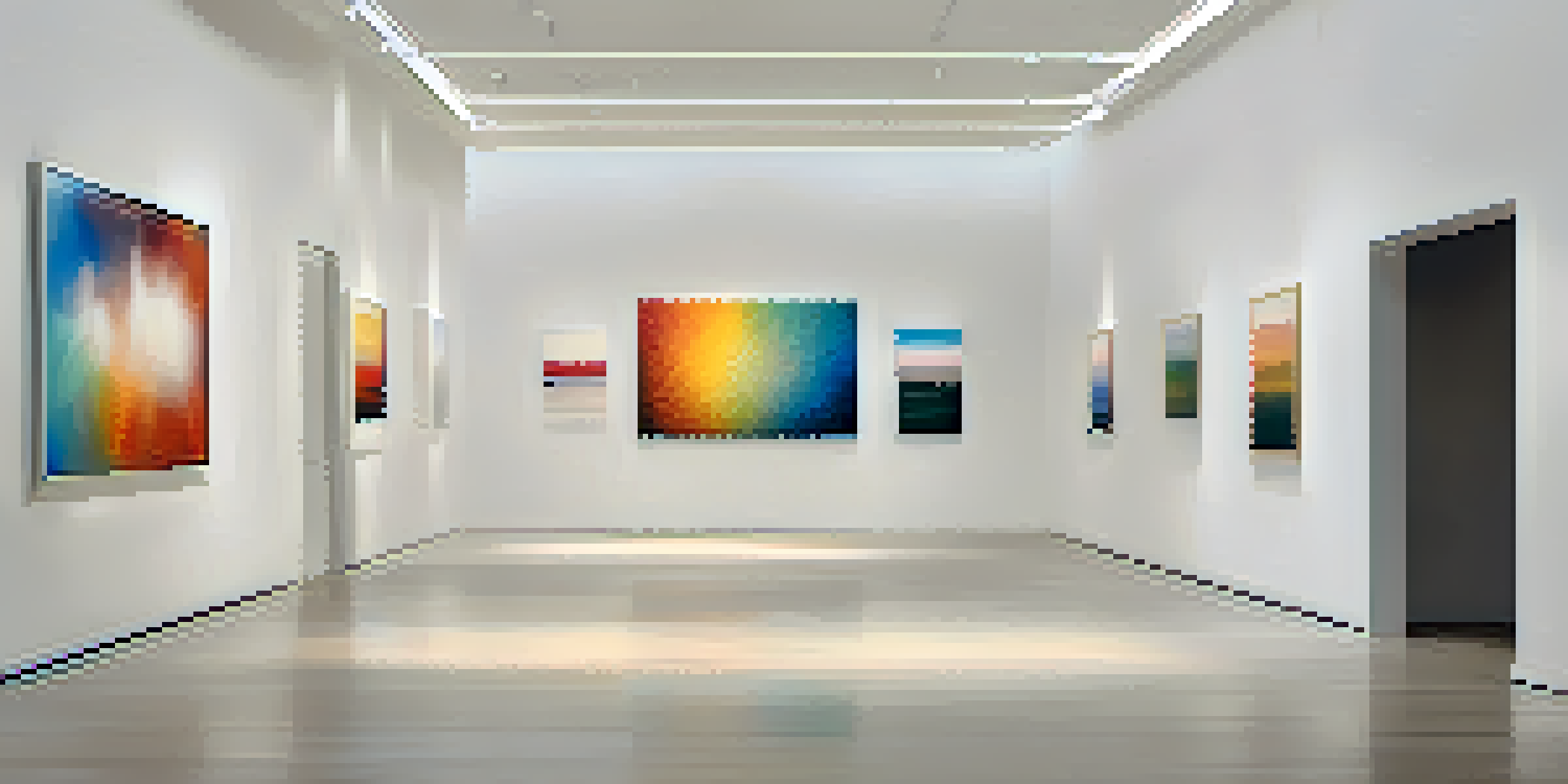
Imagine walking through an art gallery; the space between pieces allows each artwork to stand out without distraction. Similarly, in digital design, white space can create a sense of organization and clarity. By strategically placing white space around NFTs, designers can guide users' attention to specific areas or actions, like purchasing or sharing an artwork.
A well-balanced layout with sufficient white space can also improve overall user satisfaction. Users are more likely to enjoy their browsing experience when they feel that the design is not overwhelming. This subtle but significant aspect of visual hierarchy can greatly influence how users interact with and perceive an NFT platform.
Visual Hierarchy and User Engagement
The impact of visual hierarchy extends beyond navigation; it significantly affects user engagement. When users can easily navigate through a platform, they are more likely to explore, interact, and ultimately make purchases. A clear visual hierarchy encourages users to spend more time engaging with the artwork, leading to a deeper connection with the NFTs.
For example, a well-structured layout that highlights featured NFTs can entice users to click through and learn more about each piece. This not only increases the chance of sales but also fosters a community around the artwork. When users feel guided and informed, they are more inclined to share their experiences, further enhancing engagement.
Typography Impacts Engagement
Effective typography communicates importance and enhances readability, significantly improving user interaction with NFTs.
In contrast, a disorganized interface can frustrate users, potentially driving them away. By prioritizing visual hierarchy, NFT designers can create an inviting environment that keeps users engaged and encourages repeat visits, ultimately benefiting the platform's success.
Balancing Aesthetics and Functionality
While visual hierarchy is crucial for navigation, it is essential to strike a balance between aesthetics and functionality. A beautifully designed NFT platform can attract users, but if it lacks clear navigation, users may quickly lose interest. Designers must ensure that the visual elements not only look appealing but also serve a practical purpose.
For instance, while a unique layout might seem innovative, if it complicates navigation, it could hinder user experience. Striking this balance requires a keen understanding of user behavior and design principles, ensuring that every element serves a purpose without compromising the overall aesthetic.
Ultimately, the goal should be to create a seamless experience where beauty meets usability. A well-executed visual hierarchy can enhance both aspects, resulting in a platform that captivates users while providing an enjoyable and efficient navigation experience.